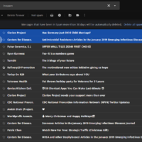
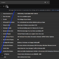
The new version of Gmail brought a few design choices and i can’t help wondering how high was the whole team that did them.
One of the changes is “you can’t choose between buttons and labels anymore, gotta pick buttons or labels”. No logic whatsoever. None.
But the weirdest is this one:
My attention is on the top, where the buttons are, right? I click the buttons and the message that confirms my actions is on the bottom left. Why? Not even in the middle, why is it on the bottom left??!?
Anybody?


Leave a Reply